What I Learned After Building 50 Dashboards No One Used

When I started building dashboards, I thought usage would come naturally. I imagined business users logging in daily, clicking filters, saying “Wow!” in meetings.
But here’s what actually happened:
I built over 50 dashboards. And hardly anyone used them.
At first, I blamed the audience. “They’re not data-driven.” But over time, I realized: it wasn’t them. It was me. The dashboards didn’t solve real problems, weren’t intuitive, and didn’t invite adoption.
So here’s what I learned — the hard way — about building dashboards people actually use.
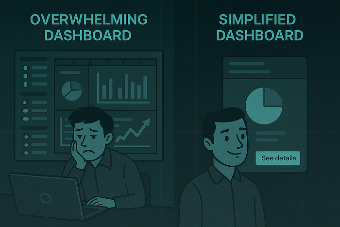
🙈 1. Just Because It Looks Good Doesn’t Mean It Works
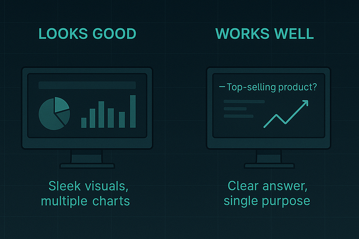
My early dashboards looked sleek. I used the right colors, modern fonts, even KPI cards that sparkled with conditional formatting.
But users still didn’t use them. Why?
Because it wasn’t about how it looked. It was about how easy it was to get an answer.
🟢 What I changed:
- Reduced chart types per page
- Replaced stacked visuals with single-purpose ones
- Added titles that read like questions:
“What’s our top-selling product?” not “Product Sales by SKU”
🧩 2. “All-in-One Dashboards” Are for Builders, Not Users
One time I built a dashboard with 8 tabs, 20+ visuals, and 5 slicers on the landing page. I was proud of the flexibility.
Users were overwhelmed.
People don’t want to build their own insights every time they open a report. They want fast answers. Not an adventure.
🟢 What I changed:
- Split large dashboards into task-specific reports
- Created summary views with one-click detail links
- Set default filters to match 80% use cases
🧑💼 3. I Asked for Requirements. I Should’ve Asked for Use Cases.
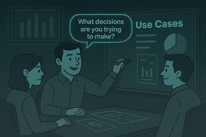
Early on, I’d ask: “What metrics do you want?”
They’d say: “Revenue, profit, customer count.”
So I’d deliver exactly that.
But what I should’ve asked was:
“What decisions are you trying to make?”
That shift changed everything.
🟢 What I changed:
- Interviewed users like a product manager
- Sketched mockups before building
- Made adoption part of the delivery process
🧪 4. If No One Uses It, It Doesn’t Matter
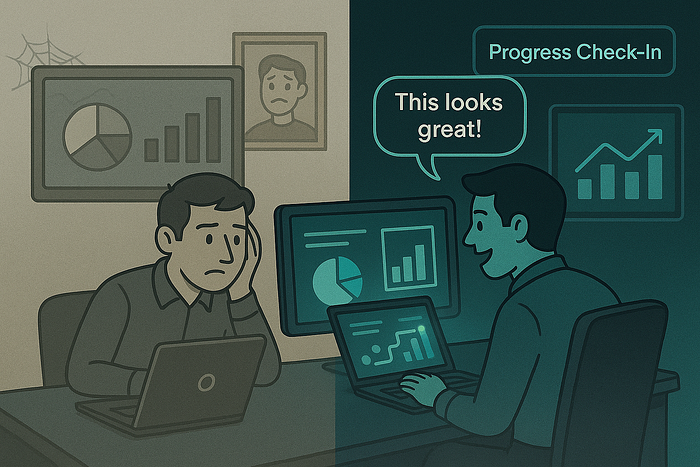
I used to think my job ended when the dashboard was published.
But a great dashboard no one uses is… useless.
Now I track usage. I do onboarding. I iterate.
🟢 What I changed:
- Added report usage metrics (via Power BI log or GA in embedded apps)
- Included quick tooltips, report guides, and walkthroughs
- Scheduled feedback check-ins 1–2 weeks after release
✅ Wrap-Up: Dashboards Are Products
Every dashboard you build is a product. It has users. It solves a problem. It deserves design, onboarding, and iteration.
So if you’re building dashboards that don’t get used — don’t give up.
Just shift your mindset:
- From designer to product thinker
- From builder to partner
- From visuals to value
Because adoption isn’t luck. It’s built.
📚 Want to Go Deeper?
- How to Build Dashboards That Drive Action — Storytelling with Data
- Power BI UX Guidelines — Microsoft Docs
- Avoiding Dashboard Creep — DataChops
{{cheat-sheet-4}}
{{popup-cheatsheet-1}}
.avif)
.avif)