
How to Use Field Parameters in Power BI Like a Pro

When Power BI introduced Field Parameters, it quietly solved one of the biggest frustrations report developers face:
“How can I let users pick which metric or dimension to analyze — without building 10 versions of the same visual?”
Field parameters let you switch columns or measures dynamically using slicers — without complex bookmarks, buttons, or DAX hacks.
In this post, you’ll learn:
- What field parameters are
- How to build one step-by-step
- Real-world examples you can apply today
Let’s dive in.
🔄 What Are Field Parameters?
Field parameters allow you to create a slicer that controls what’s shown in a visual, like switching between:
- Different columns (e.g., Region vs Segment vs Country)
- Different measures (e.g., Sales vs Profit vs Margin)
- Even entire fields in different visuals
And the best part? You do it without duplicating charts or creating multiple bookmarks.
🛠️ How to Create a Field Parameter in Power BI
Let’s walk through an example of switching measures.
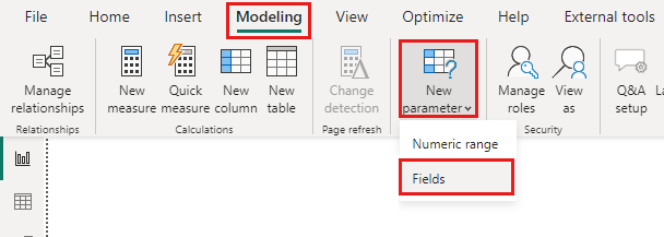
1. Go to Modeling > New Parameter > Fields
This opens the Field Parameter dialog box.
2. Add Your Target Measures
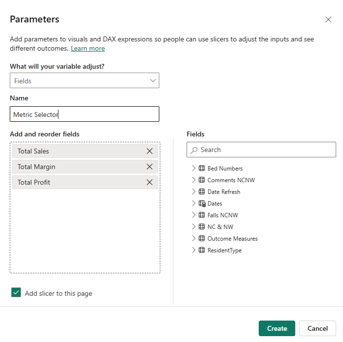
You’ll choose from your existing measures — like:
Total SalesTotal ProfitProfit Margin
Name the parameter something like Metric Selector.
3. Enable Slicer Sync
Once created, Power BI generates a new table (like Metric Selector) with your selected fields. Add it to a slicer.
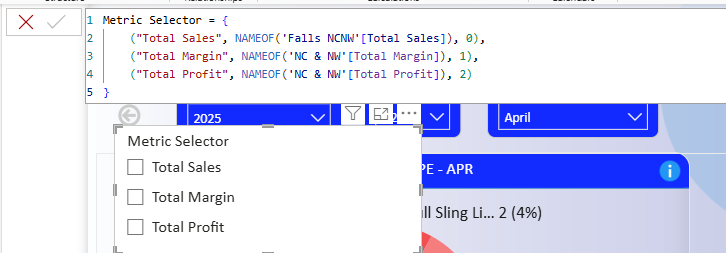
4. Use It in a Visual
Drop the new parameter field into your visual’s Y-axis or Values — and it will dynamically update based on the slicer selection.
Boom. One chart, many perspectives.
⚡ Real-World Use Cases
🧪 Interactive KPIs
Let users toggle between Sales, Profit, and Margin in a single card or line chart — perfect for executive dashboards.
🌍 Dynamic Breakdown Dimensions
Let users choose how to slice data: by Region, Product Category, or Customer Segment — with a single slicer.
📊 Smart Table Views
Allow table visuals to swap columns dynamically: e.g., switch between quarterly, monthly, or YTD views.
💡 Tips & Best Practices
- Use meaningful display names for your fields — don’t show
[Measure]or[Column]names as-is - Group parameters logically: e.g., create one for metrics, another for dimensions
- Style slicers with toggle buttons for better UX (horizontal orientation works great)
-
🚧 Limitations to Keep in Mind
- Currently doesn’t support conditional formatting based on the field selected
- Doesn’t always play well with tooltips or custom visuals
- Can become confusing if you nest too many parameters
Still — field parameters are incredibly powerful for 80% of user-driven needs.
✅ Wrap-Up: Let Your Users Explore, Without the Chaos
Field parameters unlock a whole new level of user-driven interactivity — without cluttering your reports with bookmarks or duplicate visuals.
If you haven’t started using them, now’s the time. They’ll make your reports cleaner, smarter, and easier to maintain.
📚 Further Reading
- Introducing Field Parameters — Microsoft
- Dynamic Measures with Field Parameters — SQLBI
- Power BI Feature Guide — Analytics Academy
{{quiz}}
.avif)

.avif)